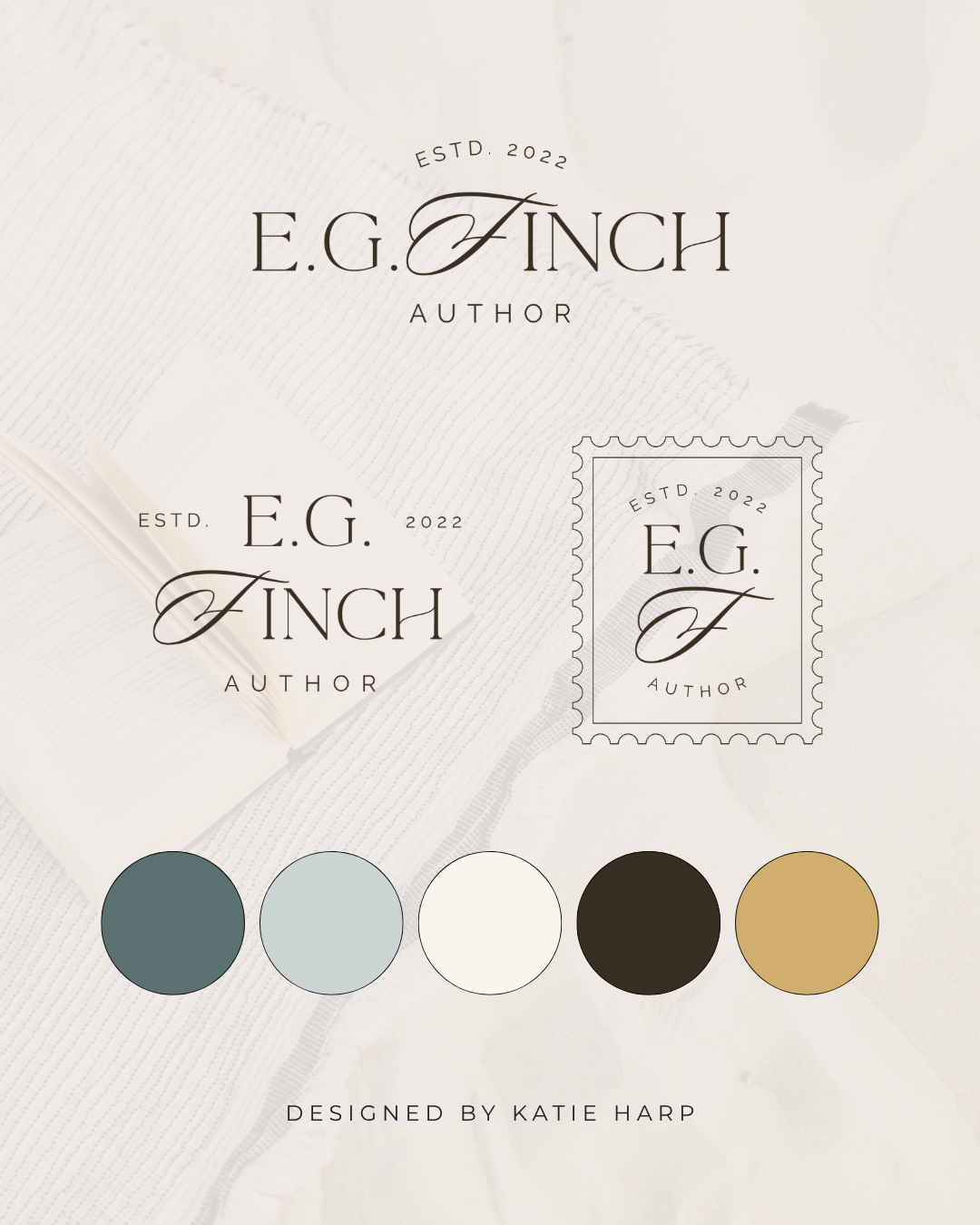
Your brand colors do more than make your business look pretty. They help shape the first impression people have of your brand and can communicate feelings like trust, energy, creativity, or sophistication before someone even reads a word. So if you're choosing your brand colors, it's worth thinking about what they might be saying about your business.
Affiliate Disclaimer: This page may contain affiliate links, which means we earn a commission when you buy through our link (at no additional cost to you). As an Amazon Associate, I earn from qualifying purchases. Read our full Affiliate Disclosure.
Why Do Brand Colors Matter?
Color is one of the first things people notice about a visual brand.
Think about some of the biggest brands you know. You can probably picture their colors without even seeing their logo.
That's because we naturally connect colors with certain brands, feelings, and experiences.
Your business can use color in the same way.
The right color palette can help your brand feel
Professional
Friendly
Creative
Luxurious
Playful
Trustworthy
Energetic
Calm
Your colors don't tell your entire brand story, but they can help set the tone.
Blue Can Feel Trustworthy and Professional
Blue is one of the most popular brand colors, and for good reason.
It can communicate feelings like
Trust
Stability
Calm
Confidence
Professionalism
That's why you see blue used so often by businesses in industries like finance, technology, healthcare, and consulting.
But blue doesn't automatically make a brand feel boring or corporate.
A bright blue can feel energetic and playful, while a deep navy can feel sophisticated and established.
The shade matters just as much as the color itself.
Green Can Feel Fresh and Grounded
Green is often associated with nature, growth, and freshness.
It can communicate
Growth
Health
Nature
Balance
Sustainability
Calm
It's a natural choice for businesses related to wellness, sustainability, food, gardening, and the environment.
But green isn't limited to those industries.
A rich emerald green can feel luxurious, while a soft sage can feel calm and understated.
Yellow Can Feel Cheerful and Energetic
Want your brand to feel happy?
Yellow might be worth considering.
Yellow can communicate
Optimism
Happiness
Energy
Creativity
Friendliness
It's a great option for brands that want to feel approachable and upbeat.
The challenge with yellow is making sure there's enough contrast for your text and other design elements to remain easy to read.
A soft buttery yellow and a bright lemon yellow can also create very different moods.
Orange Can Feel Bold and Friendly
Orange has plenty of personality.
It can communicate
Energy
Enthusiasm
Creativity
Friendliness
Confidence
It's a good choice for businesses that want to feel approachable without blending into a sea of blue and gray.
A soft peach can feel warm and playful, while a bright orange can feel bold and energetic.
Red Can Feel Powerful and Confident
Red tends to grab attention.
It can communicate
Energy
Passion
Confidence
Excitement
Urgency
It's a strong choice when you want your brand to make an impact.
But because red is such an intense color, using it thoughtfully is important.
A deep burgundy can feel elegant and sophisticated, while a bright red can feel much more energetic.
Pink Can Feel Playful and Creative
Pink isn't just one thing.
Depending on the shade and how it's used, pink can feel
Playful
Feminine
Romantic
Creative
Soft
Bold
A pale blush can create a very different feeling from a bright hot pink.
Pink can work beautifully for creative businesses, beauty brands, personal brands, and businesses that want a softer visual identity.
And if you love pink but don't want your brand to feel overly feminine, pairing it with unexpected colors can completely change the mood.
Purple Can Feel Creative and Luxurious
Purple has long been associated with creativity, imagination, and luxury.
It can communicate
Creativity
Individuality
Imagination
Luxury
Mystery
A deep plum can feel rich and sophisticated, while a light lavender can feel soft and playful.
Purple can be a great choice when you want your brand to feel distinctive without being too loud.
Black Can Feel Sophisticated and Modern
Black is a classic.
It can communicate
Sophistication
Luxury
Power
Simplicity
Confidence
A black-and-white palette can feel incredibly polished and timeless.
But black can also feel serious or stark depending on how it's used.
Adding warm neutrals, softer photography, or a brighter accent color can make a black-based brand feel much more approachable.
White Can Feel Clean and Minimal
White might not be the first color you think about when creating a brand palette, but it plays an important role in design.
White can communicate
Simplicity
Cleanliness
Calm
Minimalism
Freshness
It's also incredibly useful for creating breathing room in your designs.
A brand doesn't need to be filled with color to have personality.
Sometimes a simple palette with plenty of white space can make a much stronger impression.
Neutrals Can Feel Timeless and Sophisticated
Beige, cream, taupe, gray, and brown can create a very different feeling from brighter colors.
Neutrals can communicate
Warmth
Sophistication
Calm
Timelessness
Simplicity
They're especially popular in modern, luxury, lifestyle, and creative branding.
And you don't have to choose between neutrals and color.
A neutral palette with one bold accent can be a beautiful combination.
Don't Choose Your Colors Based on Meaning Alone
Here's the important part.
Color psychology is useful, but it's not a rulebook.
You don't have to use blue because you want people to trust you.
You don't have to avoid black because you want your brand to feel friendly.
And you definitely don't have to choose a color simply because an article says it represents your industry.
Your entire visual identity affects how a color feels.
The shade, typography, photography, layout, and colors you pair together all matter.
A bright pink paired with a delicate script font creates a very different impression than that same pink paired with bold black typography.
Think About the Feeling You Want to Create
Instead of asking
"What color should my industry use?"
Try asking
"How do I want people to feel when they experience my brand?"
Do you want them to feel
Excited
Comfortable
Inspired
Confident
Curious
Calm
Energized
Welcomed
Then choose colors that support that feeling.
This gives you much more flexibility and helps you create a brand that feels like your business instead of a generic version of your industry.
Consider Your Ideal Clients
Your brand colors should also appeal to the people you want to attract.
Think about who your ideal clients are and what they value.
What visual styles are likely to catch their attention?
What would feel trustworthy to them?
What would make your business feel like the right fit?
You don't need to choose colors solely based on your audience.
Your brand should still feel authentic to you.
But finding the overlap between your personality and your audience's expectations can make your branding much stronger.
Think About the Colors Together
One color by itself doesn't tell the whole story.
Your color palette is what really creates the visual personality of your brand.
For example
A navy blue with cream and gold can feel classic and sophisticated.
A sage green with warm beige can feel calm and natural.
Bright pink with orange can feel playful and energetic.
Black with white and a bold red can feel modern and dramatic.
Think about how your colors work together rather than choosing each color separately.
Don't Use Every Color You Like
This is a hard one.
You might love pink.
And blue.
And green.
And orange.
And purple.
And yellow.
But that doesn't mean they all need to go into your brand palette. 😉
A strong brand palette usually has a clear hierarchy.
You can have one or two main colors, several supporting colors, and a few neutrals.
This gives you plenty of flexibility without making every design look like a completely different brand.
Make Sure Your Colors Work Everywhere
Your color palette needs to work beyond your logo.
Think about how your colors will look on
Your website
Social media graphics
Pinterest graphics
PDFs
Lead magnets
Presentations
Business cards
Email graphics
You'll also want to make sure your text has enough contrast against your backgrounds so your content stays easy to read.
A beautiful color palette isn't very helpful if you can't actually use it effectively.
What If You Love Your Colors but Your Branding Still Feels Wrong?
Sometimes the problem isn't the colors themselves.
You may have a great color palette but combine it with fonts, photography, or design elements that don't match.
That's why branding needs to work as a complete visual system.
Your colors, typography, logos, photography, and layouts should all support the same overall style.
If they don't, your branding can still feel disconnected even when every individual piece looks great.
Frequently Asked Questions
What are the best colors for a business brand?
There isn't one best color for every business. The right colors depend on your brand personality, ideal clients, industry, and the feeling you want to create.
What color makes a brand look professional?
Blue, navy, black, gray, and certain neutral palettes can create a professional feeling, but almost any color can look professional when it's used thoughtfully.
How many colors should a brand have?
You don't need a huge palette. A few primary and supporting colors combined with neutral shades can give you plenty of flexibility.
Should my brand colors match my industry?
Not necessarily. Your colors should make sense for your business and audience, but they don't have to look exactly like your competitors.
Can I use bright colors in a professional brand?
Absolutely! Bright colors can still look polished and professional. It's all about the shades you choose and how you combine them with your fonts, layout, photography, and other design elements.
Can I change my brand colors later?
Yes. Your branding can evolve as your business grows. If your current colors no longer represent your business, a brand refresh can help you create a palette that feels more aligned with where you are now.
Final Thoughts
Your brand colors aren't just decoration.
They're one of the tools you can use to communicate your business's personality before someone even reads your website copy.
But you don't need to get caught up in strict color psychology rules.
Start with the feeling you want your brand to create, think about the people you want to attract, and choose a color palette that feels like your business.
The best brand colors aren't necessarily the trendiest ones or the ones that supposedly mean a certain thing.
They're the ones that work together to create a visual identity you feel excited to use everywhere.
If you're ready to finally have a brand that feels polished, intentional, and like a real reflection of your business, check out my semi-custom branding. Choose the design you love, send me your details, and I'll take care of the rest!
Want to level up your branding?
With semi-custom branding, you get a brand design complete with logos, color palette, and font pairings, customized with your business name and colors.