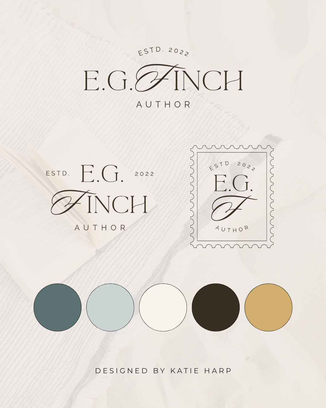
Does your branding feel a little all over the place? Maybe your website has one look, your Instagram has another, and your Canva graphics seem to belong to a completely different business. The good news is that you probably don't need to start over. A few intentional changes can make your branding feel much more polished, consistent, and cohesive.
Affiliate Disclaimer: This page may contain affiliate links, which means we earn a commission when you buy through our link (at no additional cost to you). As an Amazon Associate, I earn from qualifying purchases. Read our full Affiliate Disclosure.
Start With a Clear Brand Style
Before you change anything, step back and look at the bigger picture.
What do you want your brand to feel like?
Maybe you want it to feel
Modern
Warm
Playful
Elegant
Bold
Minimal
Creative
Approachable
Choose a few words that describe your ideal brand style.
These can become your guide when you're deciding what stays, what goes, and what needs to change.
Without a clear direction, it's easy to make individual design choices that look nice on their own but don't work together.
Stick to a Consistent Color Palette
One of the fastest ways to make your branding feel more cohesive is to use the same colors consistently.
That doesn't mean you have to use the exact same color on every single graphic.
Instead, create a defined palette with a few colors that work well together.
You might have
A primary brand color
One or two supporting colors
A light neutral
A dark neutral
An accent color
Then use those colors across your website, social media, PDFs, presentations, lead magnets, and other marketing materials.
When people see the same colors repeatedly, your brand becomes much easier to recognize.
Limit Your Fonts
This is a big one.
If you're using six different fonts across your website and graphics, your branding is probably going to feel chaotic.
You really don't need that many!
A simple font system might include
One heading font
One body font
One optional accent font
For example, you might pair a bold serif heading font with a clean sans serif for your body text.
Once you've chosen your fonts, stick with them.
Consistency will make your brand feel much more intentional.
Use Your Logo Consistently
Your logo doesn't need to look exactly the same everywhere, but you should have a system for how you use it.
A complete brand identity might include
Primary logo
Alternate logo
Submark
Each version can have a different purpose.
For example, your primary logo might work best on your website header, while your submark might be better for social media graphics or smaller spaces.
The important part is knowing which version to use and when.
Use Consistent Photography
Your photography can have just as much impact on your brand as your logo.
Think about the overall look and feel of your images.
Do you want them to be
Bright and colorful
Warm and cozy
Clean and minimal
Dark and dramatic
Natural and candid
Editorial and polished
You don't need every photo to look identical.
But when your images have a similar tone, lighting, and overall style, your brand will feel much more cohesive.
This is especially important for your website and social media.
Pay Attention to Your Graphics
Sometimes branding feels inconsistent because of the small details.
Maybe one graphic has a thin border.
Another has a huge headline.
Another uses a completely different layout.
Another has five different design elements competing for attention.
You don't need every graphic to be a clone.
Instead, create a few simple design rules.
For example
Use the same heading style
Keep your logo in a consistent location
Stick to your brand colors
Use the same font combinations
Repeat a few visual elements
Give your designs plenty of breathing room
These little patterns add up.
Create Templates for Repeated Content
If you regularly create the same types of content, templates can be incredibly helpful.
You might create templates for
Instagram posts
Pinterest graphics
Blog graphics
Lead magnets
Presentations
Proposals
Client documents
Templates make it much easier to stay consistent because you don't have to reinvent your visual style every time you create something.
Just make sure your templates are actually based on your brand.
Don't create 15 templates that all look completely different!
Make Your Website Match Your Brand
Your website should feel like a natural extension of your branding.
Your logo, colors, fonts, photography, buttons, and other visual elements should all work together.
If your website looks completely different from the rest of your business, visitors may wonder if they've landed in the right place.
Your website doesn't have to use every single brand element.
But the overall look and feel should be recognizable as your brand.
Don't Forget About Your Copy!
Cohesive branding isn't only visual.
Your brand voice matters too.
If your website sounds professional and polished but your social media sounds completely different, your business can feel inconsistent even if your visuals are perfect.
Think about how you want your business to sound.
Maybe you want your voice to be
Friendly
Conversational
Encouraging
Playful
Direct
Professional
Then try to carry that tone across your website, emails, social media, and other customer touchpoints.
Your visual identity and brand voice should feel like they belong to the same business.
Use the Same Brand Elements Everywhere
Take a look at all the places people might encounter your business.
Do your
Website
Instagram
Pinterest
Email marketing
Lead magnets
Proposals
PDFs
Business cards
Client documents
feel like they belong to the same brand?
They don't need to be identical.
But they should share some recognizable elements.
This is what creates consistency across your entire customer experience.
Stop Changing Your Branding Every Five Minutes
Okay, maybe not literally every five minutes.
But if you're constantly changing your colors, fonts, or design style, it's going to be very difficult to create a cohesive brand.
You might see a beautiful new color palette and want to change everything.
Then you discover a new font combination.
Then you fall in love with another logo style.
Before long, your brand has completely changed three times.
Give your visual identity some time to work.
You don't need to change your branding every time you see something you like.
Create a Simple Brand Guide
You don't need a 50-page brand book.
A simple guide can be enough.
Include things like
Logo variations
Color codes
Font names
Font hierarchy
Photography direction
Basic design guidelines
This gives you something to reference whenever you're creating something new.
It can also be incredibly helpful if you eventually hire a designer, virtual assistant, or other team member to create content for your business.
What If Your Branding Is Too Far Gone!?
Sometimes your branding isn't just a little inconsistent.
Sometimes you look at everything and think, "Where do I even start?"
If your current branding feels outdated, too DIY, or completely disconnected from your business, it may be time for a refresh.
That doesn't necessarily mean you need a full custom rebrand.
Semi-custom branding can be a great option if you want a polished, cohesive visual identity without starting from a completely blank page.
You can choose a professionally designed brand direction you love and have it personalized for your business.
Frequently Asked Questions
Why does my branding feel inconsistent?
Your branding may feel inconsistent because you're using too many colors, fonts, logo variations, photography styles, or design styles. It can also happen when your visual identity changes from platform to platform.
How many colors should I use in my branding?
A simple palette of a few coordinated colors is usually enough. You don't need a huge collection of colors to create an interesting brand.
How many fonts should I use?
Two or three fonts are usually plenty. Choose fonts that complement each other and assign each one a specific role so your typography stays consistent.
Does my website need to match my branding?
Your website should feel like an extension of your brand. It doesn't need to use every brand element, but your colors, fonts, photography, and overall visual style should feel connected.
Does brand consistency really matter?
Yes! Consistent branding makes your business easier to recognize and can create a more polished, professional experience for potential clients and customers.
Do I need a brand guide?
You don't need a complicated brand guide, but having a simple reference for your logos, colors, fonts, and visual style can make it much easier to stay consistent.
Final Thoughts
Cohesive branding doesn't come from making every single thing look identical.
It comes from making intentional choices and repeating the right elements consistently.
Start with a clear brand style, simplify your colors and fonts, create a few design rules, and make sure your website and marketing materials all feel like they belong to the same business.
And if you're realizing that your current branding needs more than a few tweaks, that's okay too!
Sometimes the easiest way to create a cohesive brand is to start with a professionally designed foundation rather than trying to piece everything together yourself.
If you're ready to finally have a brand that feels polished, intentional, and like a real reflection of your business, check out my semi-custom branding. Choose the design you love, send me your details, and I'll take care of the rest!
Want to level up your branding?
With semi-custom branding, you get a brand design complete with logos, color palette, and font pairings, customized with your business name and colors.