Squarespace Font Pairing Ideas for Your Website
Choosing fonts might seem like a small detail, but they play a big role in how your website feels. The right font pairing can make your brand feel modern, elegant, playful, or professional before visitors even read a single word. If you're designing a Squarespace website, here are some font pairing ideas and tips to help you create a polished, cohesive look.
Squarespace Font Pairing Ideas for Your Website
Why Font Pairings Matter
Your fonts are part of your brand identity.
They help communicate your personality and make your website easier to read.
A great font pairing should
Reflect your brand
Be easy to read
Create visual hierarchy
Feel consistent across every page
The goal isn't to use the trendiest fonts. It's to choose fonts that support your message and create a great experience for your visitors.
Keep It Simple
One of the biggest mistakes I see is using too many different fonts.
In most cases, two or three fonts are all you need.
A common combination is
One font for headings
One font for body text
This creates enough contrast to add interest while keeping your website clean and cohesive.
Pair a Serif With a Sans Serif
One of the easiest ways to create balance is by combining a serif font with a sans serif font.
Serif fonts often feel
Elegant
Timeless
Sophisticated
Traditional
Sans serif fonts tend to feel
Modern
Clean
Minimal
Friendly
Together, they create a look that's both professional and approachable.
Match Your Fonts to Your Brand
Your font choices should reflect the personality of your business.
For example:
Elegant brands often use refined serif fonts paired with clean sans serifs.
Modern brands tend to favor simple sans serif combinations with lots of white space.
Creative brands may use a more expressive display font for headings while keeping body text easy to read.
Playful brands can experiment with rounded or handwritten fonts, as long as readability remains the priority.
Think about how you want people to feel when they land on your website.
Your fonts should support that feeling.
Prioritize Readability
Beautiful fonts don't help if they're difficult to read.
When choosing fonts, make sure
Body text is clear and legible
Headings stand out without being overwhelming
Font sizes are comfortable on both desktop and mobile
There is enough contrast between your text and background
If visitors have to work to read your content, they're less likely to stick around.
Leave Room to Breathe
Typography isn't only about the fonts themselves.
Spacing matters just as much.
Generous white space, comfortable line spacing, and consistent heading sizes help your website feel more polished and easier to scan.
A clean layout often feels more premium than one that's packed with text.
Popular Font Pairing Styles
Here are a few timeless combinations to inspire your website.
Elegant and Luxury
A sophisticated serif heading paired with a clean sans serif body font.
Perfect for
Interior designers
Wedding professionals
Coaches
Luxury service providers
Modern and Minimal
A bold sans serif heading paired with a lighter sans serif body font.
Perfect for
Marketing agencies
Consultants
Creative studios
Tech businesses
Friendly and Approachable
A soft serif heading paired with a simple, readable sans serif body font.
Perfect for
Therapists
Virtual assistants
Educators
Small businesses
Creative and Artistic
A unique display font for headings paired with a neutral body font.
Perfect for
Designers
Artists
Photographers
Creative entrepreneurs
Remember That Fonts Are Only One Piece of Great Design
It's easy to spend hours choosing fonts.
While typography is important, it isn't what makes a website successful.
A beautiful website also needs
Clear messaging
Strategic page layouts
Easy navigation
Strong calls to action
Trust-building content
Fonts help create the first impression.
Your strategy is what turns visitors into clients.
Want More Font Pairing Inspiration?
If you're still trying to find the perfect combination, I've created a free resource to help.
My Squarespace Font Pairing Guide includes beautiful font combinations that work well for Squarespace websites, making it easier to create a professional look without spending hours testing different options.
It's a great starting point if you're designing your own website or refreshing your brand.
Frequently Asked Questions
How many fonts should I use on my Squarespace website?
For most websites, two or three fonts are enough. Use one for headings and one for body text to create contrast while keeping your design clean and consistent.
What are the best fonts for a business website?
The best fonts are the ones that match your brand and are easy to read. Clean serif and sans serif fonts are popular because they create a professional, timeless look.
Can I upload custom fonts to Squarespace?
Yes! Depending on your Squarespace plan, you can upload custom fonts or choose from the platform's built-in font library to better match your brand.
Should all of my branding use the same fonts?
Ideally, yes. Using the same fonts across your website, social media, and marketing materials creates a more consistent and recognizable brand.
Where can I find Squarespace font pairing ideas?
A font pairing guide can save you time by showing combinations that already work well together. Instead of guessing, you can choose a pairing that matches your brand's style and personality.
Final Thoughts
The right fonts won't magically help you book more clients, but they do shape the way people experience your brand.
When paired with thoughtful strategy, clear messaging, and beautiful design, great typography helps create a website that feels polished, professional, and memorable.
If you're looking for inspiration, download my free Squarespace Font Pairing Guide to discover combinations that work beautifully on Squarespace websites. And if you'd rather have someone handle the entire design for you, check out my Website in a Week service. Together, we'll create a website that's as strategic as it is beautiful.
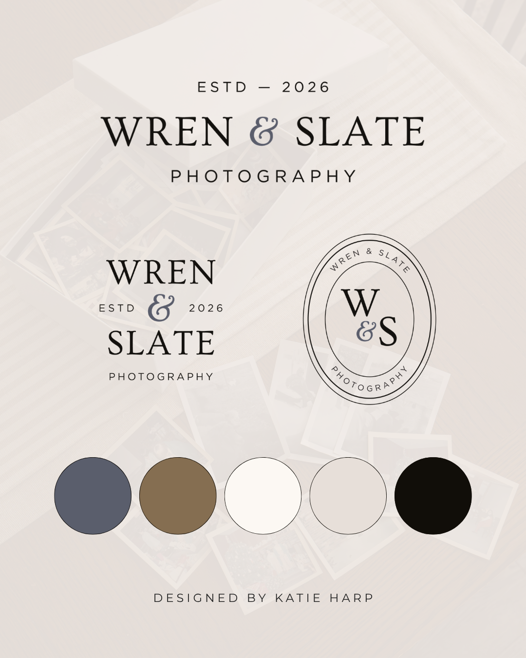
Want to level up your branding?
With semi-custom branding, you get a brand design complete with logos, color palette, and font pairings, customized with your business name and colors.