Color Palette Inspiration for Your Branding
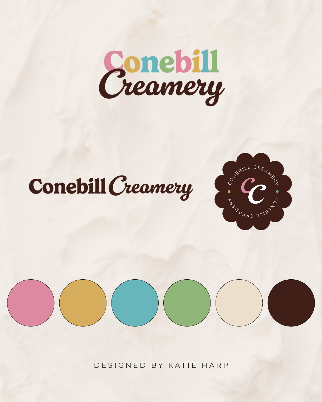
Your brand colors do more than make your business look pretty. They help shape how people feel about your business before they read a single word. The right color palette can make your brand feel warm, modern, playful, luxurious, or trustworthy. Here are some color palette ideas and tips to inspire your branding.
Affiliate Disclaimer: This page may contain affiliate links, which means we earn a commission when you buy through our link (at no additional cost to you). As an Amazon Associate, I earn from qualifying purchases. Read our full Affiliate Disclosure.
Why Your Brand Colors Matter
Your colors influence how people perceive your business.
A consistent color palette helps you
Build brand recognition
Create a professional look
Stand out from competitors
Create a consistent experience across your website and marketing
While your services are what truly matter, your visual branding helps people quickly understand the personality behind your business.
Start With Your Brand Personality
Before choosing colors, think about how you want people to describe your brand.
Do you want it to feel
Modern
Elegant
Playful
Calm
Luxurious
Bold
Creative
Approachable
Your answers will help guide your color choices.
For example, soft neutrals create a very different feeling than bright, saturated colors.
8 Color Palette Ideas for Your Brand
1. Warm Neutrals
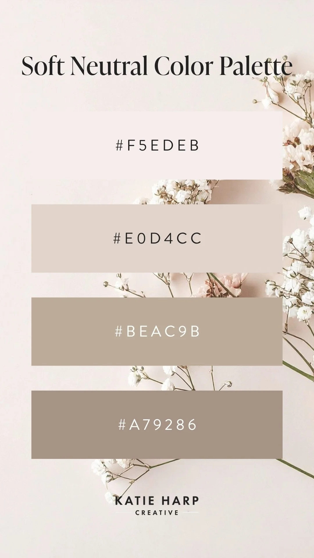
Soft Neutral Color Palette
Think
Cream
Beige
Camel
Soft brown
Charcoal
This timeless palette feels warm, welcoming, and sophisticated.
Perfect for
Interior designers
Coaches
Wellness brands
Creative service providers
2. Modern Black and White
A simple black-and-white palette never goes out of style.
Add one accent color to create personality without overwhelming your design.
Perfect for
Consultants
Agencies
Personal brands
Luxury businesses
3. Soft Earth Tones
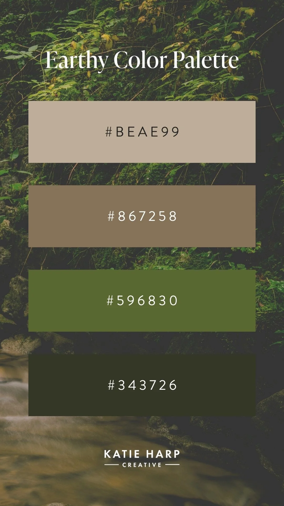
Earthy Color Palette
Think
Sage green
Terracotta
Clay
Sand
Warm ivory
Earthy palettes create a calm, grounded feeling.
Perfect for
Wellness businesses
Therapists
Sustainable brands
Home-focused businesses
4. Coastal Blues
Combine
Navy
Ocean blue
Beach sand
White
These palettes feel fresh, trustworthy, and calming.
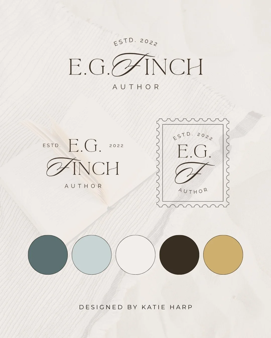
Coastal Color Palette
Perfect for
Authors
Financial professionals
Travel brands
Service businesses
Consultants
5. Bold and Colorful
Mix vibrant colors like
Coral
Mustard
Teal
Cobalt blue
Bright pink
These combinations feel energetic, creative, and memorable.
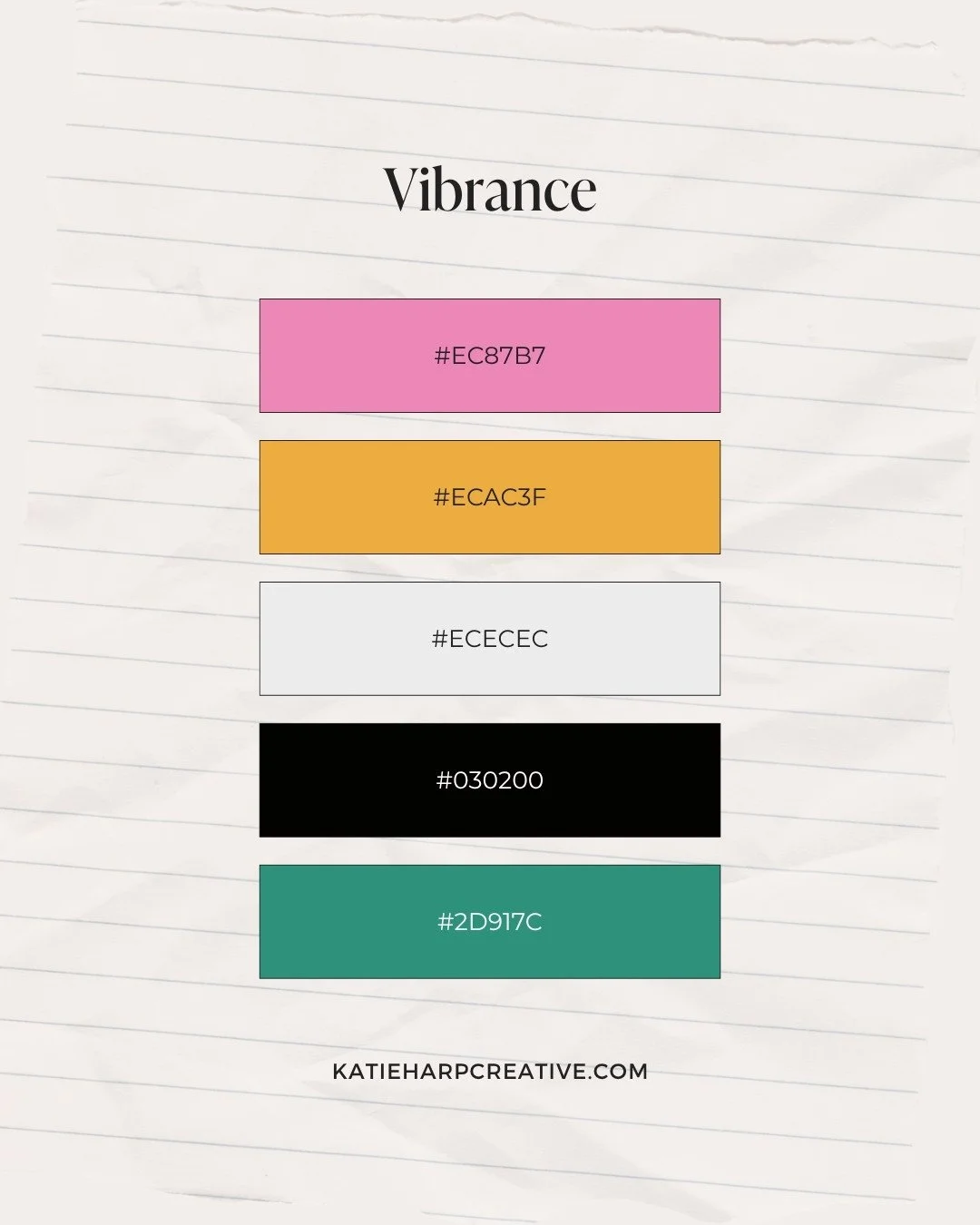
Vibrance Color Palette
Perfect for
Designers
Marketing agencies
Creative entrepreneurs
Children's brands
6. Feminine Pastels
Think
Blush
Lavender
Soft peach
Cream
Warm gray
These palettes feel friendly, approachable, and refined.
Perfect for
Wedding professionals
Coaches
Lifestyle brands
Creative businesses
7. Moody Luxury
Try rich shades like
Forest green
Deep navy
Burgundy
Espresso
Gold accents
This combination feels premium and sophisticated.
Perfect for
Luxury service providers
Attorneys
Interior designers
High-end consultants
8. Minimal Modern
Keep things simple with
White
Charcoal
Soft gray
Taupe
Olive
Minimal palettes let your content and photography shine.
Perfect for
Architects
Designers
Photographers
Modern brands
Don't Choose Colors Based Only on Trends
Every year brings a new "it" color.
While trends can be fun, they shouldn't be the only reason you choose a palette.
Instead, choose colors that
Reflect your personality
Appeal to your ideal clients
Support the feeling you want your brand to create
Will still feel like you in several years
A timeless palette often has much more staying power than one built around current trends.
Use Color Consistently
Once you've chosen your palette, use it consistently across your business.
That includes your
Website
Logo
Social media graphics
Email marketing
Business cards
Presentations
Lead magnets
Consistency helps people recognize and remember your brand.
Remember That Color Is Only One Part of Branding
Beautiful colors can create a wonderful first impression.
But they're only one piece of a successful brand.
Strong branding also includes
Clear messaging
Consistent typography
Professional photography
A strategic website
A memorable customer experience
When all of those pieces work together, your brand becomes much stronger.
Frequently Asked Questions
How many colors should a brand palette have?
Most businesses do well with a palette of three to six colors. I usually go for four or five colors. This usually includes one or two primary colors, and a few secondary colors, including a dark neutral and light neutral.
How do I choose colors for my brand?
Start with your brand personality and the emotions you want people to feel. Then choose colors that support those qualities while appealing to your ideal clients.
Should my website use the same colors as my branding?
Yes. Using a consistent color palette across your website and marketing materials creates a more professional and recognizable brand.
Can I change my brand colors later?
Absolutely. Many businesses refresh their branding as they grow. Just be sure your new palette reflects your current business and is applied consistently across all of your marketing.
What colors work best for service businesses?
There isn't one perfect palette. The best colors depend on your audience and brand personality. A coach may choose warm neutrals to create a welcoming feel, while a creative agency may use bold, vibrant colors to stand out.
Final Thoughts
Your brand colors help tell your story before visitors read a single headline.
When your color palette reflects your personality and is used consistently across your website and marketing, it creates a stronger, more memorable brand.
Of course, great branding is about more than choosing beautiful colors. Pair your color palette with clear messaging, thoughtful strategy, and a well-designed website, and you'll create an experience that helps build trust from the very first visit.
If you're ready for a Squarespace website that reflects your brand and attracts your ideal clients, check out my Website in a Week service.
Want to level up your branding?
With semi-custom branding, you get a brand design complete with logos, color palette, and font pairings, customized with your business name and colors.